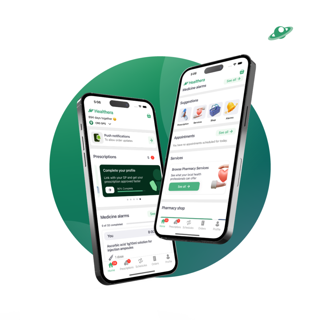
The latest app update brings the biggest stylistic change we’ve undertaken in the past two years.
After a series of consumer tests, the clearer, cleaner look of Healthera’s new home screen is designed to put the most important elements front-and-centre, making life even easier for hundreds of thousands of patients.
Action Cards | The new cards action section at the top of the screen centres around outstanding actions and unread notification so patients always know what to do next.
App Suggestions | Brand new to the app, we’ve added the ability for pharmacies to show the most commonly used sections of their digital home – helping educate people on everything pharmacy has to offer.
New Style | Of course, we’re always adding new features to the Healthera platform, but this update has also brought a focus on aesthetic design – with all our new features being underpinned by a clean, clinical look.
These recent changes to the Healthera app will also be rolled out to all “White-Label” apps that Healthera maintains for pharmacy groups across the country.


